(Note: this is more relevant for people using our older Divi-based sites)
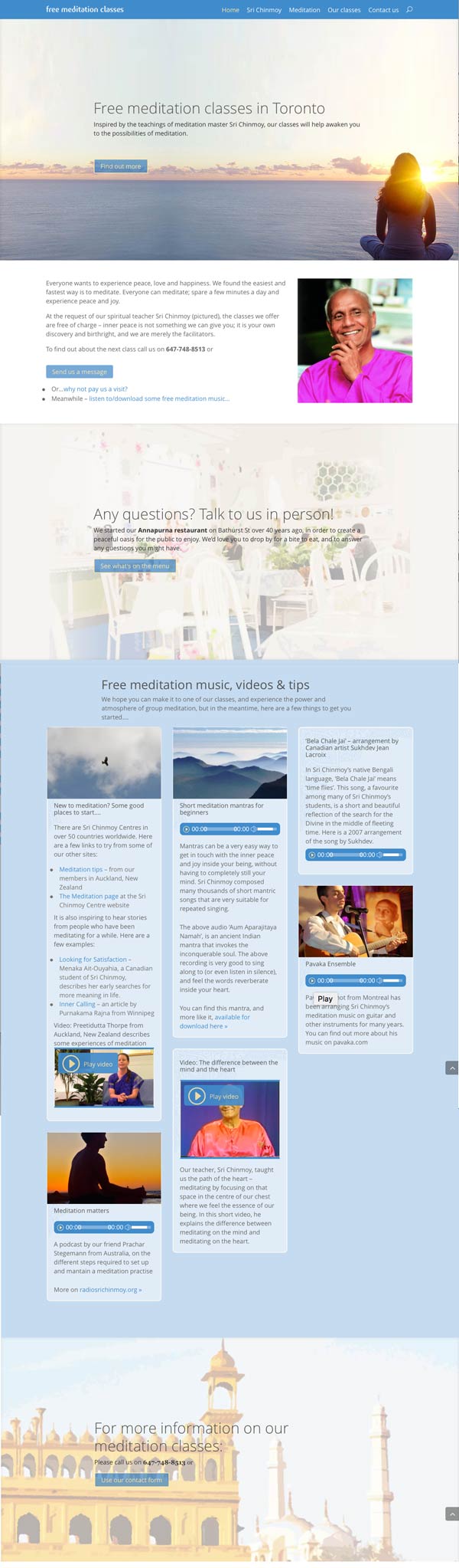
A plan for the front page might look like this – this is a plan we did for www.torontomeditation.org
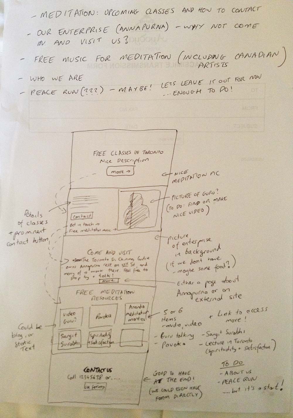
Initial notes:
- Before we do any drawing, we made a bullet point list of what we wanted (see top of page). It is important to set realistic goals at the beginning. There might be many things we would like to include, but it is good to first focus on what can be achieved in the next couple of weeks.
- Your primary task is to have people feel something immediately, and to get them interested.
Then we made a rough drawing of what the front page might look like:
- Our drawing is divided into sections. Many modern front pages divide the page into different full-width sections, each of which communicate a separate idea. This make the site easier to comprehend to the user, as each idea is given its own space.In our example: the above page has 5 sections, which broadly correspond to the 5 things we wrote down at the top of the page.
- You should be thinking at this stage about how people will navigate between sections, and how they will navigate to other pages on the site. In the above diagram, we have used dashed arrows to show navigation between different sections.
- Let people know where to find you. In this plan, we put a prominent contact button in the second section.
- If you would like to feature parts of our path that are not immediately connected to meditation, try to think about how you would explain the connection – eg sports, Peace Run. Even the connection with enterprises is not immediately obvious to some people.For example – we introduce our enterprise above as a place where people can come in and talk to us
This is how the final site turned out – you can compare it to the drawing above.