
Note: most of this are just tips that come from our experience with creating pages, rather than hard and fast rules.
Page layout tips
1. Break things up:
Its not good to have too much unbroken text. You can break things up by using images, videos, quotes and bullet points. A good rule of thumb is to ‘break things up’ every 2 or 3 paragraphs. (Definitely text is still good! Having all images/videos don’t look so good either)
Of course, dividing your page into sections and using headings (Header 2) and subheadings (Header 3) is a great way to give some structure to a page.
2. Images are our strength
One real strength of the Peace Run is images – we have so many good ones! And good images convey our message more immediately than text. See our section on image styles below.
Video as image
Note: Videos can also serve as good images, even if people dont play them. On Vimeo especially, you can make very nice images and upload them as your video thumbnail (you should also remove title and byline in embed settings). Its important to keep the image size the same as the video size. For example HD 1920×1080 px is a very common image size.
3. Check how pages look on desktop and mobile
Most things should look fine on both desktop and mobile, but a couple of things you should look out for….
- Images with text, make sure they are readable on mobile!
- Fullwidth images are usually much wider than wider, so they can look very ‘thin’ on mobile
- Floated images – maybe they are very small on mobile. In that case you can use the ‘floated on desktop’ classes
This image needs to be full-width on mobile to be readable, so we use the ‘float on desktop-only’ class
4. Dont overdo fullwidth images
One new feature we have is fullwidth images, that stretch all the way from one end of the screen to the other. This is very powerful, but also very easy to overdo. What has worked for us is
- Dont use fullwidth images too close to the top: it reduces the impact of the banner image
- If you set an image as fullwidth, don’t set your next one as full width – have a regular width or floated image in between fullwidth
- Especially for fullwidth, its important there is at least one thing in the image that really grabs the attention, that the image is not too busy with lots of things happening and nothing stands out.
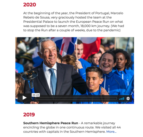
- This is a good use of full width images, interspersed with other images: https://www.peacerun.org/us/municipalities/
‘Table effect’ with floated images and horizontal line
5. Image ‘table effect’
We dont recommend to use tables anymore, except for actual table data
Instead if you want to make an ‘image table’ – what you can do is put your text and floated image and then add a horizontal line. The horizontal line will go underneath image and table, which will create that table effect for you.
6. Using buttons
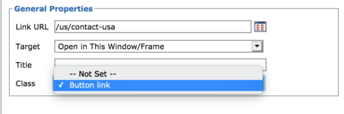
When creating a link, it is very easy to make it as a button
Use as a call to action
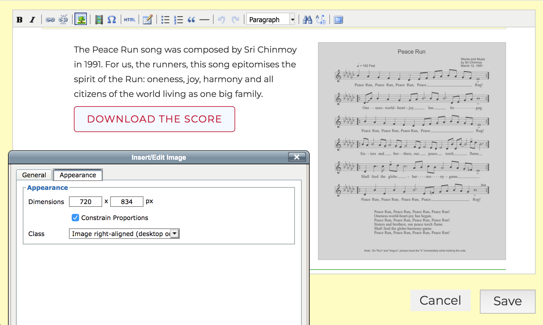
Music section – followed by button to download the song
Buttons can be a good thing to add at the end of a section or paragraph. It gives the a prominent call to action or something to do.
But it is easy also to over-use buttons. If you use them all the time to draw attention to things, they cancel each other out.
As a ‘table of contents’
For a very long page: one thing we have found useful is to have an opening paragraph or two, then some buttons leading to the different sections of the page. The buttons act as a sort of ‘table of contents’.
Using buttons as a table of contents
The only difficulty for this right now is you have to create anchor links, which means you need to know a little about html:
In HTML mode, you create an anchor by adding id="anchorname" to a header like this:
<h2 id="casestudies">Case studies</h2>

Then you can just link to #casestudies (Note the # at the beginning)
Image sizes
Dont upload images straight from your camera! Large images take a long time to load and slow down the whole page. Use an image resizing service like Photoshop
As a general rule we should keep the filesize of images as small as possible. Ideally its good to keep images to 200-250kb, but for banner and fullwidth images this might be hard. In that case 400kb is a good upper limit. There is often a tradeoff between filesize and getting the image to look good.
Top banner images
These should be around 1600×800 px. Try to upload images below 250kb if possible, or 400kb at the very least.
Page images
There are 4 different ways of fitting images on the page – this can be selected after uploading the image in the Appearance tab
- regular width. If you add an image to a page, by default it will be resized to the width of the page. Images here should be less than 250kb. These images should be at least 755px wide, or else they start to look really blurry. But they can be even larger to take advantage of retina screens – even twice the width (1510px) as long as the filesize is ok. These images look best when they are in landscape ratio (in other words, the width should be greater than the height)
- fullwidth images – try to keep below 400kb. Too look best on all screens, the width:height ratio should be between 2:1 and 3:1 (in other words the image should be 2 or 3 times as wide as it is high). The ideal width is about 2000px but it might be hard to keep your image below 400kb, 1500-1600px is also acceptable.
- floated images. This means that the images go on the left or right of the text. Portrait images (where the height is greater than the width) work best here, but there is no hard and fast rule. They should be minimum 305px wide, but its good to upload 610px wide to take advantage of retina screens. Since these images are smaller, you can try keep them below 100-150kb.
- floated images (desktop only). Some images look good floated on desktop, but not on mobile