(note – this page is mainly relevant for our Divi-based themes, although many of the ideas here are very relevant for all sites)
 The front page is the first page that most of our visitors see – it may very well be the first impression they get of the Centre.
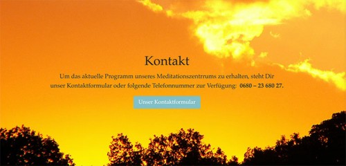
To create a strong visual impact, many of our sites now use full-width front pages, divided into sections. For example, on right – see Toronto Meditation
Divinding the page into clearly defined sections enables you to communicate a lot, and at the same time make your page comprehensible for the user. People find it easier to scroll down through different sections, instead clicking through to different pages, especially on iPad and mobile.
Here are some parts of your front pages you might want to look at:
- What people see when they first open the page
- What people see next
- Different types of front page – short and long
- Sections you could include
classgivers – books & cds – latest news & articles – what else we do - Ideas for how to end your page
(The below photos here were taken March 2017 – the sites may have been changed in the meantime)
First opening the page
Idea 1: Single full-width opening slide
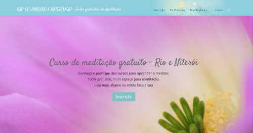
- Consists of: A nice title, a meaningful sentence to get people interested, and a button to find out more. (Example on right: Rio de janeiro)
- Where should that first button lead to? Some sites link it directly to another page (eg the contact form). This is definitely ok to do, however the downside is that this stops people from seeing the rest of the page.Instead you can use an anchor link to scroll to the next section when the button is clicked (see Dublin Meditation for example). That way, users explore the site and find out a little bit more about us (and our upcoming events), and can then decide to get in touch.
- Similarly, some sites put their contact details directly in the first sentence after the title. However, if they are interested, they will certainly find your contact details (assuming they are reasonably findable, via a menu link for example). It is good to at least give people an idea of what we are about first.
- You should definitely make sure there is a button (by providing button text and URL, otherwise people may not know to go further down the page.
- Technical details:
How to implement in page builder: add full-width section, add full-width slider, with one slide, background image, no slide image
Idea 2 – slideshow
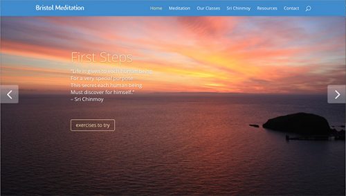 Consists of: multiple slides laid out as in idea 1, with side and/or bottom navigation (example on right: Bristol)
- Bear in mind that there is a good chance that people don’t click on subsequent slides. You can reduce that change by setting slides to go automatically. However it is best to make sure that whatever information you include on those slides is also accessible by other means
- Technical details:
How to implement in page builder: add full-width section, add full-width slider
What people see once they move down the page
Immediately after the first section, most sites like to expand a little about their classes in general, or announce specific classes.
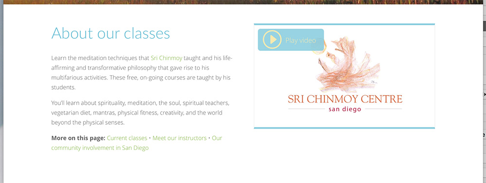
Example: San Diego: The section immediately below the opening slideshow. Note the links to the other sections, and the video on the right.
- If you have a lot of sections in your front page, this is a good place to create anchor links to the different sections
- It is also a good place to give contact details, or create a prominent button that links to your contact form
- If you have classes coming up, you could make a version of your flyer for the site. Note that landscape is definitely better than horizontal
- Technical details:
The San Diego slide was done in page builder using Regular section > half-half columns, text column in each (the video can be embedded by just pasting URL in text block).
Types of front pages – long or short?
Some sites have a shorter front page with an opening slide or slideshow and (maybe) announcing their classes, like above, and then they have a section that links to all the other parts of their site.
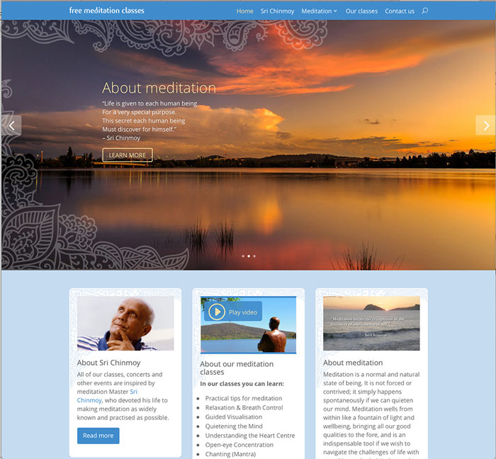
 Top example: Canberra has slideshow, then section
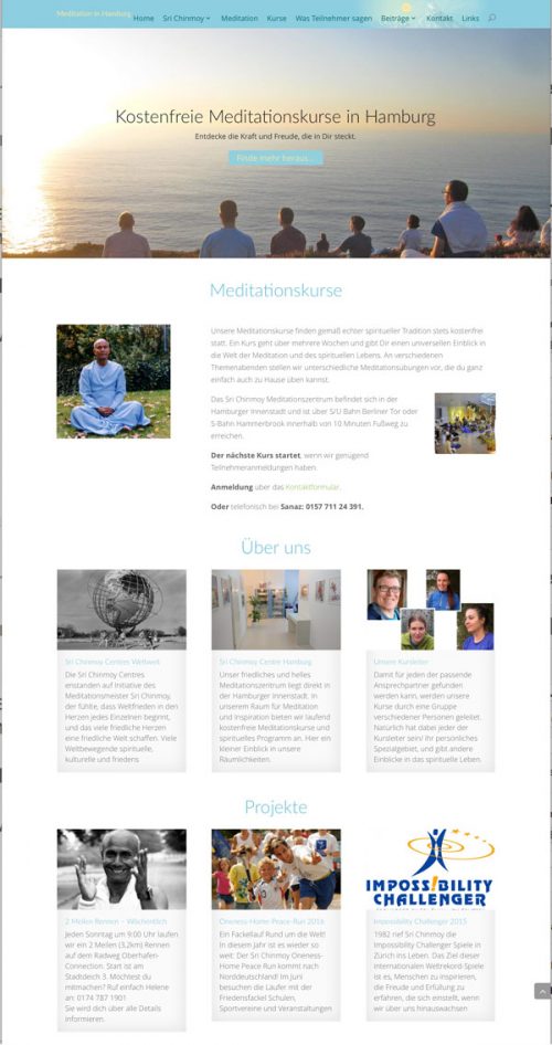
On right: Hamburg has single top slide, general section about classes, then ‘About us’ which contains links to the Centre, Sri Chinmoy and Classgivers, and then a ‘Projects’ section linking to the various projects.
Longer pages
You can also have a longer page that introduces some, or all, of these topics on their own section, straight on the front page – a good example is the toronto meditation site featured at the top of the page. The next section details the type of sections you could add.
Both short and long pages have their pros and cons. You can of course combine both – make 1 or 2 sections about particularly important topics and then link to the rest of the pages.
Sections you can include
1. About class givers
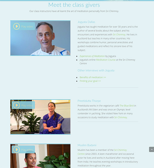
Showing our faces was something Sri Chinmoy particularly encouraged on our sites. If we are living the spiritual life properly, it will come across in our faces. It also helps us come across as human beings rather than as some anonymous organisation. If you have 3 or 4 class givers, you could put a short bio of each on the front page, with a picture or video.
Example: Auckland
Other things we do (eg Our manifestation and enterprises)
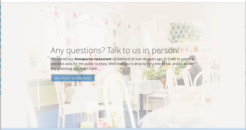
Mention things like the 2 mile Race, Peace Run etc – people see that there is a rich and vibrant community. Just remember that people come to the site expecting to read about meditation, so you need to explain these activities in that context.
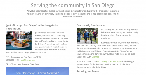
It is good to mention your Divine Enterprise as places where people can visit to talk to someone if they are interested about meditation. For example – toronto
Recent articles, meditation resources, news etc
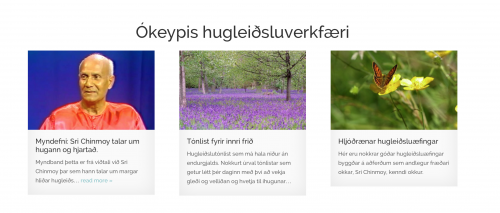
If you are writing articles, then you should certainly highlight the most recent 2 or 3 on your front page. (Read why we really, really encourage you to write articles)
We would recommend to only highlight a limited amount (3 is good), so as to make the site visible, and then have a link to the articles page for more articles.
If (as we recommend) you are focusing your articles around different categories (news, beginning meditation etc) – you could have sections for each category, with the most recent articles for that category. For example, meditation resources on hugleidsla.org
Books and CDs
You can list popular books and CDs on the site, as well as information about where they can purchase them. For something like flute music, or disciple CD’s, you could provide an audio or video sample.
Example of specific book: 222 meditation techniques on Dublin Meditation. When you click on the button, it takes you to the general book page, where more information about buying the book is listed.
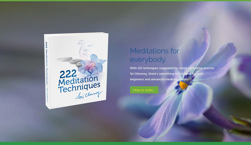
Todo: have a more generic slide, plus a book listing
Ideas for how to end the page
- At the bottom of the page, you could add another full link picture and button, see Salzburg for example. This gives visitors a natural ‘thing to do’ when they arrive at the bottom of the page.
