On important pages like the front page, people often will not read a lot of text, and sometimes a picture plus a succinct title and description will get the message across much more effectively.
The images stretch the full width of the screen and can take a long time to load on smaller devices, so we can specify smaller images to be used for mobile and tablet. We do this using shortcodes, which is basically some text inside square brackets.
The main thing – if you are not sure, or run into trouble, ask us! It is better that we spend a few minutes doing it rather than you spend a few hours.
Format
[fullwidth desktop=”/path-to-desktop-image” tablet=”/path-to-tablet-image” mobile=”/path-to-mobile-image” title=”Title goes here” description=”description goes here”]You can probably get away with just specifying the desktop image. But as well as being smaller, its also good to add separate images because you can crop them differently. The desktop images are best in a 2:1 width:height ratio, whereas tablet and mobile are usually more square so you can see them better in portrait mode.
Additional options
- morelink the url of the link at the end of description
- moretext the text of the link, defaults to more
- select – visitors are presented with a list of pages for classes. options are select or search. Select is better for country sites
- label – if select, it is the text first visible to viewer, if search the placeholder text
- worldwide – if select and on a country site, it checks the checkbox to include all cities and countries
- display – adding display=”textlower” will cause green box to go to bottom right on desktop
Examples
We have some premade examples here you can copy and modify

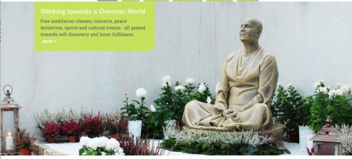
[fullwidth desktop="/files/www/display/antarik.jpg" tablet="/files/www/display/antarik-tablet.jpg" mobile="/files/www/display/antarik-mobile.jpg" description="Free meditation classes, concerts, peace initiatives, sports and cultural events - all geared towards self-discovery and inner fulfilment." morelink="#more" title="Working towards a Oneness-World"]

With a select list of cities offering meditation classes: [fullwidth desktop="/files/www/display/antarik.jpg" tablet="/files/www/display/antarik-tablet.jpg" mobile="/files/www/display/antarik-mobile.jpg" description="We offer free meditation classes and concerts in all of Australia's big cities." label="Find a class:" morelink="#more" moretext="or find out more »" title="Learn to meditate with the Sri Chinmoy Centre" select="select"]

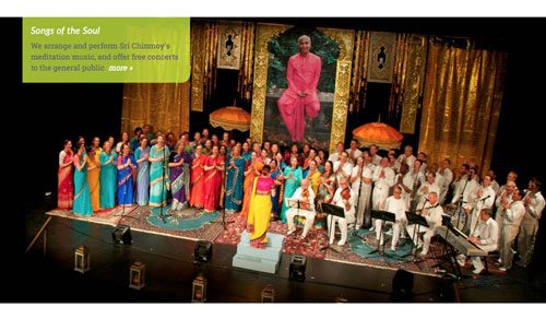
[fullwidth desktop="/files/www/display/songs-soul.jpg" tablet="/files/www/display/songs-soul-tablet.jpg" mobile="/files/www/display/songs-soul-mobile.jpg" title="Songs of the Soul" description="We arrange and perform Sri Chinmoy's meditation music, and offer free concerts to the general public" section_id="music" morelink="/music"]

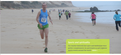
[fullwidth desktop="/files/www/display/running.jpg" tablet="/files/www/display/running-tablet.jpg" section_id="sport" mobile="/files/www/display/running-mobile.jpg" title="Sports and spirituality" description="Our teacher believed that sport and meditation were perfect complements; we participate in and organise sports events around the world." morelink="/content/athletics" display="textlower"]
