
By default, your new meditation site uses the Dhyana theme, which beginners will find easier to set up and work with than previous themes.
Some examples: Reykjavik • Zurich • Meditate now • New York • Auckland • Reading Meditation
On this page: Introduction – Customising the site – Editing the front page banner – Featured images – Homepage videos – Search engine settings – Design customisations
Note: If you are switching to Dhyana from an old theme that used the Divi page builder, this is a good checklist to follow.
Introduction
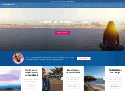
- By default, the homepage will be a combination of a front page banner (changeable in the Customize section) and a listing of latest posts.
- There are 2 main types of content – Posts and Pages. You can read more about adding and editing individual posts and pages here. In the Dhyana theme, posts generally appear in the listing below the front page banner.
- Posts are a good way to show the dynamism of your Centre – you can create posts about events you have done or about to do, answer popular meditation questions, share meditation videos and music etc. A very good example of this is https://www.umenimeditovat.cz
- Pages are more for timeless pages like About, Our Classes etc. They appear in the top menu and can also be featured on the front page slideshow.
- This theme really looks good if every page and post has a featured image. See below about adding good featured images.
Customise your site
Much of the site can be tweaked using the Customize pane – to access this from the front page of your site, go to the Customize button in the top black bar. (It can also be accessed using Appearance > Customize) in the admin area)
You will then see a pane on the left with many sections:
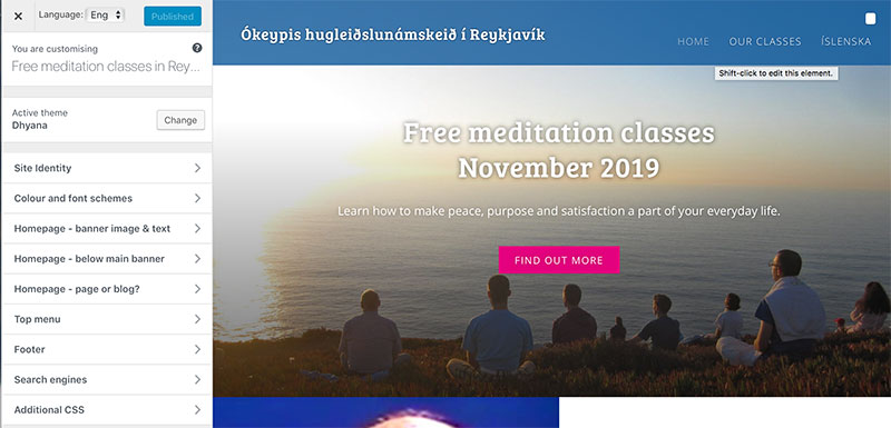
- Site identity – here you can set site title/logo and decide if you want to display just text/just logo or both. You can also set a ‘top bar’ above the header menu which is always visible on all pages – this is good for a link to the classes you are currently advertising or a number to call.
- Font and colour scheme
- Homepage image/text. The opening image and text that people see when they come to the front page. Note that everything in this section will be overridden if one of your posts or pages has the featured tag – see below about front page slideshows. (Also: if you use a static page as your front page and it has a featured image, then that image will be displayed instead of the image you select here.)
- Homepage – below main banner. You can add a short section on the front page between the top header and the rest of the site. This is a good place for some ‘about us’ information
- Homepage – page or blog? You can decide if you want your home page to be one static page or a listing of all your recent posts. Many sites that use Dhyana choose to have the listing, as it is automatically formatted very nicely.
- Top menu – you can add links to the top menu from here
- Footer – you can change the content of the footer by adding ‘widgets’ – for example, a listing of recent posts, a search box, or just some plain old text.
- Search engines – see below. You don’t need to worry about this immediately.
- Additional css – see below. You don’t need to worry about this immediately.
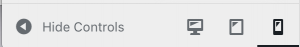
Important: check that your site looks good on all devices – desktop and mobile. One quick way to do this is to click the device icons at the bottom of the Customize page.
For multilingual sites, there is a language switcher in the top left that you can use to set different options for different languages. (Note that it doesn’t work yet for top menu, footer, and choosing the front page – you can set these instead in the admin area.)
Changing the front page banner
-
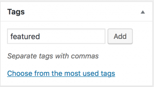
(Note: if you dont see this box on your edit page, try clicking on ‘Screen Options’ in the top right, and selecting ‘Tags’)
There are 2 ways to change the front page banner. The first way is going to Customize » Homepage image/text (see above)
- Alternatively, all posts with that have been given the tag featured (or featuredplus) will automatically appear in the top banner. This overrides anything in the Customize section (and you will see a message there).
- If you have featured posts, you can edit the top banner by clicking through to the posts and editing them. In particular, the ‘description’ on the front page (the text between title and button) can be changed by adding/changing the Excerpt (if the excerpt is empty, the first words of the post are used instead)
- Any posts that have been marked for the top banner should have a featured image (see below)
-
(If you do not see an ‘Excerpt’ section on your edit page – click on ‘screen options’ top right and then check ‘Excerpt’ – it will then appear below main text body.)
On the edit page, the Excerpt section is usually below the text editor. If you add something here, this is what will be shown on the front page, otherwise, the first few words of the content will be used.
- Creating a slideshow: If more than one post is marked featured or featuredplus, then a slideshow is created.
- Anything with tag ‘featuredplus’ gets posted both to front page post listing and the top banner. Anything with tag ‘featured’ gets posted to top banner, but not to the general post listing below.
Featured images
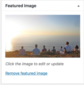 You can add a featured image to a post or a page using the Featured Image section, which is usually at the bottom of the right-hand side of the edit page. (If you can’t see this box, try going to Screen Options in the very top right of the page, and seeing if the Featured image box is checked)
- The image will be shown at different sizes (and also could change from landscape to portrait) depending on whether people see the site on desktop/mobile/tablet etc. So it is good to check after you upload that the image looks good at all sizes – you can do this on a desktop by simply resizing your screen.
- Most of the time you don’t need to worry too much about this, except if your picture is of something where cropping is an issue, like a face. You should be ok if you upload featured images as landscape, with the main focus of attention being in the centre of the image.
- We are aiming to collect a library of featured images that look good at all sizes and will be available to all our meditation sites – these images are available under ‘Global Media’.
- If you are having difficulty with getting a particular image to look good at all sizes, let us know – we have some detailed information about our image sizes at the bottom of this page.
- Optimal size – 1800×900 is best, but 1200×700 will also do. To look there best, we recommend we recommend landscape images with the main ‘action’ of the image in the middle.
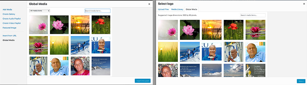
How to access global media: inside a single post (left) or via customizer page (right)
Hiding posts on home page
- Anything with tag ‘hide’ gets hidden from front page
Homepage videos
You can play videos directly from the post listing on the front page.
- Create a new post and give it a title
- Add a video as normal by pasting in a Vimeo or Youtube URL into the text editor. (You can also add some text if you want, but people won’t be able to click through to it directly from front page)
- Change the post format to Video
- Add a featured image as usual
- We would recommend also adding a short excerpt to the post – less than 20 words. This is what will be shown on the front page to introduce the video.
Notes:
- This does not apply to posts tagged as ‘featured’
- If you want people to click through to the post and read the full text (even if there is a video), then you can just leave the post format as Standard.
- The other options for post format (Image and Audio) don’t do that much at the moment, aside from changing the icon and read more text. If in doubt, stick to Standard.
Detailed information
You don’t need this at the very beginning – you should go ahead and make sure your site is good enough for visitors before reading any further.
Title and description for search engines
We can influence the text that search engines show when they list our site; a nice title or description might encourage more people to click on the link to our site.
- For the front page, you can go to Customize > Search engines and fill in a title and description to use.
- For each page or post, we can create a customized title and description in the ‘Custom Fields’ section. You can also hide some pages from search engines. (Note: if you use a static page for the front page and have a custom title/description there, it will override the one in the Customizer)
- If you don’t fill these in for every page, don’t worry too much – by default, the site tries to automatically create some sensible text to use. But try and do it for the important pages.
- This is a good article about the search engine description and why and how you should use it
Design tweaks
- There is a range of colour and font options available in the Customize page under Colour and font schemes
- If you know a little about CSS, you can also customise using the Additional CSS section in the customize page – for example, changing colours etc to match your current poster design.
If you come up with something good, you could send it to us and we could include it as a colour scheme for everyone to use.
The below CSS is a good place to start with changing the colour scheme of the site. It shows the colours available to the current ‘default’ scheme.
.site-header{background-color:rgba(36,38,41,.8);}

.home .site-header{background-color:rgba(36,38,41,.4)}

.site-branding{color:#fff}

.site-inner button, .button, input[type="submit"],#below-banner{background:#678db8}

.link-more a,#below-banner-link .button{background:#e7ae01;color:#fff}

.is-singular .entry-inner:after{border: 1px #abb7c3 solid}

.entry-inner:after{background:#fff}

.entry-inner:before{color:#abb7c3;}

#below-banner-image img{border-color: #e7ae01;}

#topbar-text{background-color: rgba(36, 51, 70, 0.9); color: rgb(208, 208, 208);}

@media only screen and (max-width: 960px) {

.site-header,.is-scrolled .site-header,.blog .site-header,.home .site-header{background-color:#292c2f}

}

.has-post-thumbnail .entry-meta .cat-links{background:#678db8;color:#fff;}

.is-singular .post-navigation .nav-links:after, pre:before,.single-event .entry-header:after {background-color:#e7ae01; }

.play-icon:before{color:#678db8;border:3px #678db8 solid;}

.site-footer { background-color: #292c2f; color: #616a74; }

.footer-bottom-info { background-color: #242629; }

.widget-area a {color: #858d95;}

.widget ul li {border-bottom: 1px solid #363b40;border-top: 1px solid #363b40;}

.widget h3{color: #8c97a2;}
Featured image sizes
As we said above, 99% of the time you can just upload a featured image to a post, and the site will take care of cropping the images so they show on different devices.
For very important pages and images, the image crop might not be satisfactory. One option might be to crop every image exactly how you want it, and send them to us so we can include in our Global Media library
- 1800×720 – used for featured posts on desktop
- 768×950 – used for desktop single post, featured posts on tablet
- 768×400 – used for tablet single post
- 450×600 – used for desktop blog (>1200px), featured posts on mobile
- 450×250 – used for mobile blog, mobile single post, desktop blog (between 960 and 1200px)